Stitch Fix Case Study
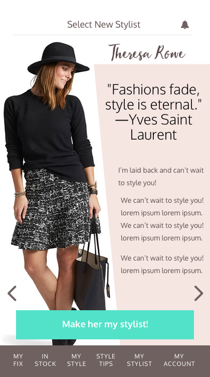
This project is the result of work I did through Springboard's online UX course. The goal was to take the project through the entire UX process of research, discovery, design, and validation. I redesigned the user experience of Stitch Fix - an online styling service that delivers personalized pieces directly to your doorstep.
The Challenge
The biggest challenge I faced going into this project is the fact that Stitch Fix is a service and not a product. Thus, many of my constraints were issues users had with the actual service offerings of Stitch Fix versus the usability of the applications. Focusing on these problems would require changes to the business model and that was out of scope for this project. Instead, I provided solutions to address other common issues by devising unique features to allow the user more flexibility and freedom of choice.
The Research
I started by conducting interviews with women who have used the service before. This helped frame some of my assumptions that I wanted to further examine. I crafted an online survey and had over 600 Stitch Fix users participate. Additionally, I did a competitive analysis to better understand what other styling services offered that Stitch Fix didn’t. The research validated some of my earlier conjectures but also exposed other problems.
Sampling of Online Survey Results from over 600 Stitch Fix Users
The Results
Users complained about a lack of size ranges, cost and quality of the clothes, the initial styling fee, poor communication and the inability to exchange clothes for another size. Initially, I spent too much time focusing on how to tackle some of these service issues. Without the ability to directly work with the company to change the business model, I shifted my focus on solving communication issues between the stylists and the users.
Developing personas and user stories helped me see a pattern. The overall user problem was the connection they had to their stylist (or lack thereof). Stylists changed too often (without notice) and the amount of feedback a user was able to give was limited. Another problem that arose through my research was that most users only kept 1-2 of the 5 pieces sent in a fix.
Goals:
- Give users more direct contact with their stylist for a more personalized experience.
- Increase the number of pieces a user purchased each time to improve upon the success rate of each fix.
User Stories Based on Personas
The Ideation
At first there were so many ideas that the list became overwhelming. I had to distill all the ideas down to the features that would best support the goals. Then, I developed user flows to demonstrate those features. Next, I organized content with sitemaps and wireframes. I refined the content architecture in my sketches and then built wireframes in Sketch.
Sketches
The Prototype
My Sketch wireframes were pulled into InVision to expand upon the user flows. Seeing how the user would move through these flows really helped to flesh out steps that were missing. One of the challenges was deciding if I wanted to spend time on some of the flows that already existed within Stitch Fix’s app. Ultimately, if they didn’t support the goals I decided not to try to fix things that weren’t broken.
Sample of Screens from First Iteration Prototype in InVision
User Testing
Once the basic prototype was in place, I wrote a script to follow during the testing session that contained 5 specific tasks I wanted a user to accomplish by working their way through various scenarios. I tested the prototype on 3 Stitch Fix users and received vital feedback on areas that needed improvement. I needed to work on the navigation, making some of the features more apparent, and maintaining consistent branding and UI patterns throughout.
Visual Design
I designed a basic style guide to convey the general look and feel of the brand. This included a simplified logo, colors, fonts, and a simple button design. I made sure to include current Stitch Fix imagery for instant recognizability and personable language to connect with the audience. Since the audience has a wide age range and continues to grow (with men’s styling just recently being introduced), I tried not to alienate any particular user type.
Stitch Fix Style Guide
Below are a few screens with the final design touches.
Final Product
The gif below shows a click-through of some of the main user flows in the app.
Final Design Click-Through


